When is a K an N? New Balance takes on Decathlon in footwear trade mark dispute

Gareth Price

A new US trade mark dispute between New Balance and Decathlon provides another reminder that, when assessing potential infringement, context matters.
A logo may look like one thing on a designer’s screen, but quite another when it appears on the side of a shoe.
New Balance Athletics, Inc. has commenced proceedings against Decathlon America LLC and Decathlon USA LLC in the US District Court for the District of Massachusetts over a logo used on Decathlon’s KIPRUN running shoes.
New Balance alleges trade mark infringement, false association and dilution, amongst other claims. The proceedings were filed on 15 September 2026 and, at this early stage, there has been no finding of infringement.
At the centre of the dispute is a deceptively simple question: when is a K an N?
Is it a K or an N?
New Balance says it has used the letter N on footwear since the 1970s and owns several federally registered and incontestable US trade mark registrations for the letter N, alongside other rights which it collectively describes as its "N Marks". The company says the N Marks appear on virtually all of its footwear and have become strongly associated with New Balance as their source.
The dispute concerns the prominent angular device used on Decathlon's KIPRUN running shoes, an example of which is as follows:
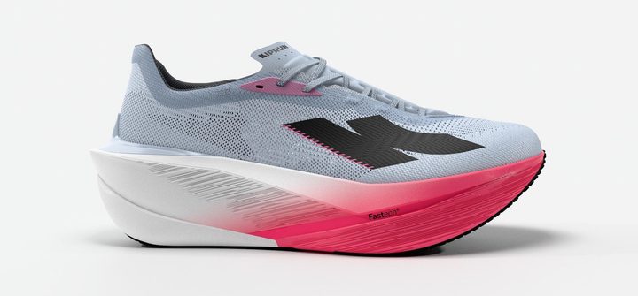
Decathlon's logo can be understood as a stylised letter K. The complication is that the design is also used in reverse.
According to the complaint, Decathlon maintains that its device is a K rather than an N. New Balance's response is that this is "half true at best", alleging that the mirrored version is confusingly similar to its own N marks.
New Balance also alleges that the positioning of the mirrored logo varies between the inside and outside of the footwear, with every pair of the accused KIPRUN shoes carrying the version it challenges.
That makes this considerably more interesting than simply placing two logos alongside one another and comparing them.
Post-sale confusion enters the picture again
One particularly interesting feature of New Balance's case is its reliance on how the KIPRUN device is encountered in the real world.
The complaint expressly refers to Decathlon's design as it is "marketed and seen by the consumer pre- and post-sale". New Balance goes further and alleges that actual confusion has already occurred, referring to online consumer material in support of that allegation. Whether that evidence establishes actual confusion or a likelihood of confusion will ultimately be a matter for the US court.
This has an interesting echo of the UK Supreme Court's decision in Iconix Luxembourg Holdings SARL v Dream Pairs Europe Inc, which I discussed in my earlier article on post-sale confusion.
Different law, different marks and a different court, but essentially the same practical question:
What does the consumer actually see when the shoe is being worn?
In Iconix, which concerned the Umbro double-diamond logo and a logo used by Dream Pairs on footwear, the UK Supreme Court confirmed that realistic and representative post-sale circumstances can be considered when assessing similarity. This can include different viewing angles where they represent how a sign is realistically perceived in normal use.
The Supreme Court also confirmed that post-sale confusion can be sufficient for a finding of likelihood of confusion, even where there is no confusion at the point of sale.
That does not, of course, tell us how the Massachusetts court will approach the very different dispute between New Balance and Decathlon. But the practical similarity between the cases is striking.
What the dispute means for brand owners
There is a broader lesson here for brand owners.
When clearing a new logo, the exercise should not necessarily stop at comparing the proposed design with earlier trade marks. Businesses should also ask:
How will consumers actually encounter this logo when we use it?
For footwear, clothing, bags and other consumer products, that may mean considering the position, scale and orientation of the logo on the finished product. Where a device is reversed or mirrored on different sides of a product, both orientations need to be considered.
The same applies when assessing potential infringement.
A sign which appears relatively different when compared side by side with a registered trade mark may produce a different impression when applied to the product itself and encountered in normal use.
That was an important practical consequence of the UK Supreme Court's decision in Iconix. New Balance's action against Decathlon demonstrates why the wider question has continuing commercial relevance.
What happens next?
New Balance is seeking injunctive and monetary relief, as well as other remedies including the removal and destruction of products bearing the challenged mark. These remain New Balance's allegations and claims for relief, and the court has not determined that Decathlon has infringed New Balance's rights.
Whatever the eventual outcome, the dispute provides another useful reminder for businesses developing and protecting brands. Trade marks do not exist in isolation. They exist on products, in advertising and, ultimately, in the real world.
And in this case, whether consumers see a K or an N may prove to be a very valuable question.
Source: US District Court for the District of Massachusetts, New Balance Athletics, Inc. v Decathlon America LLC and Decathlon USA LLC, Complaint. All allegations referred to above are New Balance's and have not been determined by the Court.
Protecting brands in the real world
Murgitroyd's trade mark attorneys advise businesses on brand clearance, filing and enforcement strategies in the UK and internationally. Considering not simply the proposed trade mark, but how consumers will encounter it in the marketplace, can help identify potential problems before they develop into expensive disputes.
Meet the author

About Gareth Price
Related insights
Featured insight

Three stripes, four stripes: The adidas v White Fox trade mark dispute
- Read article
Beyond the master brand: Building an IP strategy that supports brand expansion
- Read article
When is a K an N? New Balance takes on Decathlon in footwear trade mark dispute
- Read article
Jersey becomes a separate designation under the Madrid System from 1 August 2026
- Read article
Expansion plans mean little if you can’t use the brand
- Read article
Three key themes from INTA 2026: AI, economic uncertainty and a changing IP landscape

Murgitroyd is a leading intellectual property firm supporting innovative businesses across a wide range of sectors. From patents and trade marks to designs, copyright, and IP strategy, their expertise extends beyond legal protection to helping organisations maximise the value of their ideas. Working across industries such as life sciences, engineering, technology, and creative sectors, Murgitroyd combines technical insight with commercial understanding to deliver tailored, forward-thinking solutions.


